Here's a look at the most recent painting from my studio. SPRING ECLIPSE
Showing posts with label Art Technique. Show all posts
Showing posts with label Art Technique. Show all posts
Monday, April 13, 2009


Tuesday, February 24, 2009
Webinars - Monoprint without a Press
See the Post on March 26, 2009 for an updated version of the Webinar.
Webinars - Monoprint without a Press
See the Post on March 26, 2009 for an updated version of the Webinar.
Tuesday, February 17, 2009
Rolling acrylic paintings for shipping
Here's a question from the email bag:
"Hi Tesia- Here's a question for you. If I take a 40X60 acrylic painting off its stretchers and roll it up in order to transport it will the paint crack or is it pretty flexible? This will save me a big shipping charge. The paints, by the way, are Golden acrylics.Thanks,Frank AnsleySt. Helena, CA."
Thanks Frank for your question. There are several things to consider when rolling a painting. Rolling a painting is fine if that's the only way you can ship it. It's not the best, but it's okay. In winter weather, you want to be sure you roll the painting in room temperature with the paint film facing out.
I'm going to refer you to this excellent article http://www.goldenpaints.com/justpaint/jp11article1.php at Golden about shipping paintings. Be sure you roll the painting around a hard cardbore core.
It should be fine if it doesn't stay rolled up too long. Be sure you provide adequate unpacking instructions ON THE OUTSIDE of the container for your customer at the other end. For instance, let them know not to the leave the tube outside and to unpack it immediately.
Hope that helps!
Saturday, February 14, 2009
Matte Acrylics versus Regular acrylics

A question from the email bag: "I am trying to create a gouache-like surface with acrylic and am wondering what medium/gel to add. I am looking for super easy flow off the brush and a flat application..." Thanks to Rosalie Fanshel for submitting this question.
Rosalie: The best bet I think is to use the Matte Acrylics from Golden. You can get a very velvety surface from these. Compare the Matte Acrylics with regular Heavy Body in the picture above. The gloss of the regular Heavy Body Paint is causing a glare. Keep in mind you can also just put plenty of Matte Medium into your regular paint to knock back the glare. However, you will diminish the color somewhat since Matte Medium tends to add a waxy like effect to the color. As sh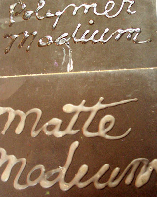 own in this photo. The words "matte medium" are in fact made with matte medium and you can see how waxy they look.
 own in this photo. The words "matte medium" are in fact made with matte medium and you can see how waxy they look.
So, there you have it. Your choices are 1) to use the Matte Acrylics from Golden or 2) to use lots of Matte Medium in the paint itself.
Hope that answers your question, Rosalie. Any other comments? Let me know.
Matte Acrylics versus Regular acrylics
A question from the email bag: "I am trying to create a gouache-like surface with acrylic and am wondering what medium/gel to add. I am looking for super easy flow off the brush and a flat application..." Thanks to Rosalie Fanshel for submitting this question.
Rosalie: The best bet I think is to use the Matte Acrylics from Golden. You can get a very velvety surface from these. Compare the Matte Acrylics with regular Heavy Body in the picture above. The gloss of the regular Heavy Body Paint is causing a glare. Keep in mind you can also just put plenty of Matte Medium into your regular paint to knock back the glare. However, you will diminish the color somewhat since Matte Medium tends to add a waxy like effect to the color. As shown in this photo. The words "matte medium" are in fact made with matte medium and you can see how waxy they look.
own in this photo. The words "matte medium" are in fact made with matte medium and you can see how waxy they look. So, there you have it. Your choices are 1) to use the Matte Acrylics from Golden or 2) to use lots of Matte Medium in the paint itself.
Hope that answers your question, Rosalie. Any other comments? Let me know.
Sunday, February 8, 2009
How to Tear Printmaking Paper
Isn't it frustrating when you try to tear a piece of beautiful, expensive printmaking paper and you don't get a nice deckled edge? Well here's the easy way to do it.
Lay the paper down on a clean table. Dip a clean watercolor brush into clean water and draw a line across the paper where you want the deckled edge. Then place a sturdy (and clean) straightedge on the water line and hold it down. Now, pull up the paper towards you in one clean, strong motion. Voila! You have a beautiful deckled edge to your paper.
Lay the paper down on a clean table. Dip a clean watercolor brush into clean water and draw a line across the paper where you want the deckled edge. Then place a sturdy (and clean) straightedge on the water line and hold it down. Now, pull up the paper towards you in one clean, strong motion. Voila! You have a beautiful deckled edge to your paper.
Saturday, December 6, 2008
Using the Old Masters for Composition
As an abstract painting teacher, I am often asked by my students "what should I paint?" I like to use the world around me as source material and in particular the Old Masters.  Old Master paintings by Rembrandt or Titan or Vermeer can provide a wealth of composition exercises to get your brain working. Here's an example of how I use these. First, take the beautiful painting "Saskia" by Rembrandt.

 Old Master paintings by Rembrandt or Titan or Vermeer can provide a wealth of composition exercises to get your brain working. Here's an example of how I use these. First, take the beautiful painting "Saskia" by Rembrandt.

Now, I've cropped a piece out.
Then after manipulating it in Photoshop this is what it looks like.  Now granted this isn't the best abstract painting I've ever done, but it gives me something to work with. I could use this painting and build an entire series from it, doing several paintings as an homage, if you will, to Rembrandt. Try this for yourself and see. Pick any artist you admire and crop small pieces out of their painting. Then manipulate it and work on it to make your own vision from it. This is an old and honored tradition among artists, re-interpreting their ancestors.
Take the work below by Picasso "Portrait of a Young Girl" Now look at the inspiration for this piece by Cranach the Younger.
 The possibilities are really unlimited. Find your inspiriation wherever you need to!

Using the Old Masters for Composition
As an abstract painting teacher, I am often asked by my students "what should I paint?" I like to use the world around me as source material and in particular the Old Masters. Old Master paintings by Rembrandt or Titan or Vermeer can provide a wealth of composition exercises to get your brain working. Here's an example of how I use these. First, take the beautiful painting "Saskia" by Rembrandt.
Old Master paintings by Rembrandt or Titan or Vermeer can provide a wealth of composition exercises to get your brain working. Here's an example of how I use these. First, take the beautiful painting "Saskia" by Rembrandt.Now, I've cropped a piece out.
Then after manipulating it in Photoshop this is what it looks like. Now granted this isn't the best abstract painting I've ever done, but it gives me something to work with. I could use this painting and build an entire series from it, doing several paintings as an homage, if you will, to Rembrandt. Try this for yourself and see. Pick any artist you admire and crop small pieces out of their painting. Then manipulate it and work on it to make your own vision from it. This is an old and honored tradition among artists, re-interpreting their ancestors.
Take the work below by Picasso "Portrait of a Young Girl" Now look at the inspiration for this piece by Cranach the Younger. The possibilities are really unlimited. Find your inspiriation wherever you need to!
Tuesday, November 11, 2008
Mixing Clean Color
The key to mixing clean color is to know your pigments. Inorganic pigments (ultramarine blue, the cadmiums, chromiums, cobalt blue, etc.) tend to make muted mixtures. Organic pigments (quinacridones, phthalocyanines, dioxizines, etc.) tend to make brilliant mixtures.
Try this head to head comparison to understand this issue better:
Take equal parts of Cadmium Red and Cobalt Blue and mix. Expected purple? Nah, you get a brownish purple...a designer might call it eggplant or mauve or something....
Now take equal parts of Quinacridone Red and Phthalo Blue and mix. Voila! A beautiful clean purple that you can tint with white and still keep brilliant.
Does this mean that one type of pigment is better than another? Of course not. Just that if you know what to expect from the pigment, you will save yourself frustration. This will also save you money becuase you will be able to mix the color you want without wasting paint.
Thursday, October 2, 2008
Making a clean hard edged shape or line
This comes up again and again in my classes. Students want to tape off a shape and make a nice, crisp hard edge. Too often after they've taped the shape off, painted it and pulled up the tape, they have a messy edge where the paint has crept under the tape.
Here's the trick to making a perfect, clean hard edged line or shape every time.
Here's the trick to making a perfect, clean hard edged line or shape every time.
- Use blue painter's tape and tape off your shape or line, burnish lightly with your thumb.
- Paint over the taped edge with clear polymer medium or matte medium.
- Let dry!
- Paint back over the taped edge with your paint.
- Let dry!
- Peel up the tape and voila! you will have a nice clean edge.
The polymer medium acts as a seal to prevent the paint from creeping under the tape. No more fuzzy lines or shapes! Be patient and let the polymer dry before you paint on it and let the paint dry before you peel up the tape and you will have perfect shapes and lines every time.
Wednesday, July 16, 2008
Less is More
I was checking out artslant.com the other day and I saw an ad by an artist, Paul Russo. I was intrigued so I visited his site. WOW! He is painting 1000 black paintings. They're beautiful, elegant, simple, complex, funny, exciting.....they run the gamut of expressions and THEY'RE ALL BLACK! Now I have proof in (ahem) black and white, that you don't need a lot of color to create fabulous, glorious work that has depth and soul. Of course there is Ad Reinhardt, Yves Klein, Robert Mangold and others, but Paul Russo seems to have brought a juicier element to the game. His work strikes me as more interactive, almost. There is lots of texture, usage of strange elements and it seems to me, a very well rounded sense of humor. "Manly Augustus Buchanan" just cracks me up. I'm not sure why but it seems to me that it's a bearded man, and that strikes me as hilarious. Maybe I've had too much coffee, or not enough. Whether it's supposed to be funny or not, it's certainly intriguing and that for me, is the mark of a good painting. Give me my nickel's worth and I'm happy!
At any rate, for a long time I've been telling my students to pare down their palette. Just one or two colors and a dark and light. I've been doing this for awhile myself. It allows me to work within a tight framework colorwise, and integrates the color in the painting. Could be I'm just lazy...but no! I really believe this technique is worthwhile and really, really hones my sense of color. It helps me see color in a new way too. In relationship to other colors, rather than each color individually. It helps me see the painting as a whole. And that can't be bad.
So thank you, Paul Russo, for giving me the opportunity to revisit this idea of "less is more" - less color is better color it seems. And it's certainly working for Paul.
Wednesday, January 23, 2008
Water and Acrylic Paint
There is a myth out there that it's okay to thin acrylic paint with water. Well it's not the best idea. Here's why:
Water is not a binder. Duh, right? Well if you use too much water in your acrylic paint mixture, you will overthin the binder in the paint (polymer) and weaken the paint film, lessening its adhesion to your canvas (or the paint layer beneath it). If you want to thin the paint, use a polymer medium. This will maintain the adhesive qualities of the paint and the paint film will maintain its integrity.
If you want to thin the paint and retard the drying time, try using Acrylic Glazing Liquid (Golden). This will allow you to make a thin glaze and slow down the drying time.
Party on!
Subscribe to:
Posts (Atom)